Module 9
ggplot2 Package
We have already learned how to visualize data using Base R. In this (and the following) module(s) we are going to learn how to do it using ggplot2 package. R has several systems for making graphs, but ggplot2 is one of the most elegant and most versatile. ggplot2 implements the grammar of graphics, a coherent system for describing and building graphs. With ggplot2, you can do more faster by learning one system and applying it in many places.
We will use mpg dataset to illustrate functionality of the ggplot2 package. It contains a subset of the fuel economy data that the EPA makes available. It contains only models which had a new release every year between 1999 and 2008 - this was used as a proxy for the popularity of the car.
print(mpg)
#> # A tibble: 234 × 11
#>    manufacturer model    displ  year cyl   trans drv     cty
#>    <chr>        <chr>    <dbl> <int> <fct> <chr> <chr> <int>
#>  1 audi         a4         1.8  1999 4     auto… f        18
#>  2 audi         a4         1.8  1999 4     manu… f        21
#>  3 audi         a4         2    2008 4     manu… f        20
#>  4 audi         a4         2    2008 4     auto… f        21
#>  5 audi         a4         2.8  1999 6     auto… f        16
#>  6 audi         a4         2.8  1999 6     manu… f        18
#>  7 audi         a4         3.1  2008 6     auto… f        18
#>  8 audi         a4 quat…   1.8  1999 4     manu… 4        18
#>  9 audi         a4 quat…   1.8  1999 4     auto… 4        16
#> 10 audi         a4 quat…   2    2008 4     manu… 4        20
#> # ℹ 224 more rows
#> # ℹ 3 more variables: hwy <int>, fl <chr>, class <chr>
Among the variables in mpg are:
-
displ- a car’s engine size, in liters -
hwy- a car’s fuel efficiency on the highway, in miles per gallon (mpg) -
cyl- number of cylinders -
class- type of a car -
drv- the type of drive train
Before we start exploring the ggplot2 package, let’s convert one of the variables into a factor:
mpg$cyl <- as.factor(mpg$cyl)Creating a ggplot Object
Every ggplot2 plot has three key components:
- Data
- A set of aesthetic mappings between variables in the data and visual properties
- At least one layer which describes how to render each observations. Layers are usually created with a geom function
To produce a scatterplot, you need to pass your data to ggplot() function:
ggplot(data = mpg)
As you can notice, it creates a plot object but does not display data. To add datapoints to this object, we add a geom_point() function with a + sign and inside the function we specify x and y variables from the dataset, which will be x and y axes, respectively:
  ggplot(data = mpg) +

  geom_point(mapping = aes(x = displ, y = hwy))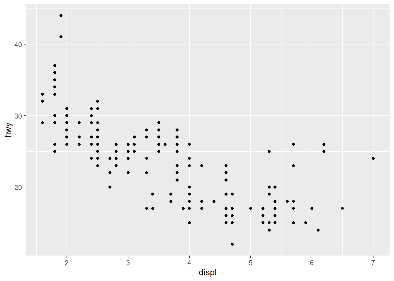
Note that we’ve put each command on a new line. It is recommended doing this in your code, so it’s easy to scan a plot specification and see exactly what’s there.
Changing the Color, Size, and Shape of Datapoints
We can change the color, size, and shape of the datapoints by passing these arguments to the geom_point() function:
  ggplot(data = mpg) +

  geom_point(mapping = aes(x = displ, y = hwy),

               color = "steelblue",

               size = 3,

               shape = 24)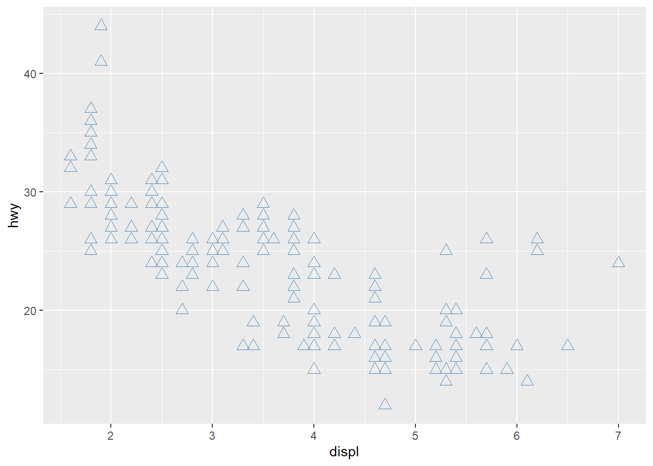
In this plot the color, size, and shape of points are static, meaning that they are the same for every point. If you want the color to change based on another variable in the dataset to reflect its categories, you need to specify this inside the aes() function:
  ggplot(data = mpg) +

    geom_point(mapping = aes(x = displ, y = hwy, color = cyl),

size = 3) 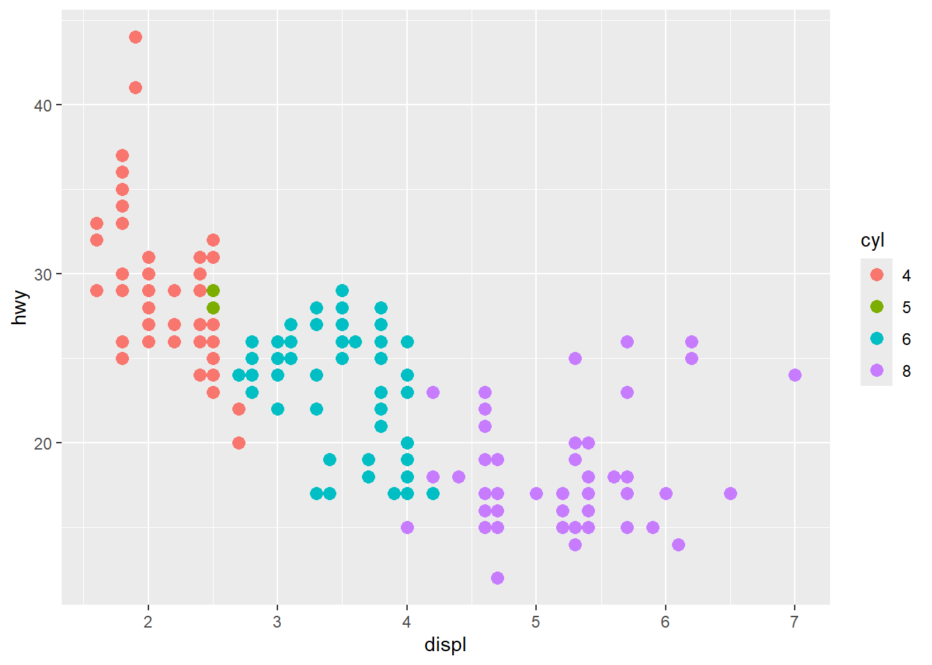
ggplot2 automatically assigned colors to the levels of cyl variable. If you want to change them manually, you need to do so using scale_colour_manual() function:
  ggplot(data = mpg) +

    geom_point(mapping = aes(x = displ, y = hwy, color = cyl),

               size = 3) +

    scale_colour_manual(values = c(`4` = "red",

                                   `5` = "blue",

                                   `6` = "orange",

                                   `8` = "yellow"))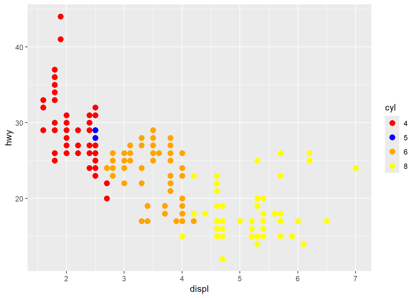
You can also change the shape of points to reflect another variable in the dataset:
  ggplot(data = mpg) +

    geom_point(mapping = aes(x = displ, y = hwy, color = cyl, shape = class),

               size = 3)
#> Warning: The shape palette can deal with a maximum of 6 discrete
#> values because more than 6 becomes difficult to
#> discriminate
#> ℹ you have requested 7 values. Consider specifying shapes
#>   manually if you need that many have them.
#> Warning: Removed 62 rows containing missing values or values outside
#> the scale range (`geom_point()`).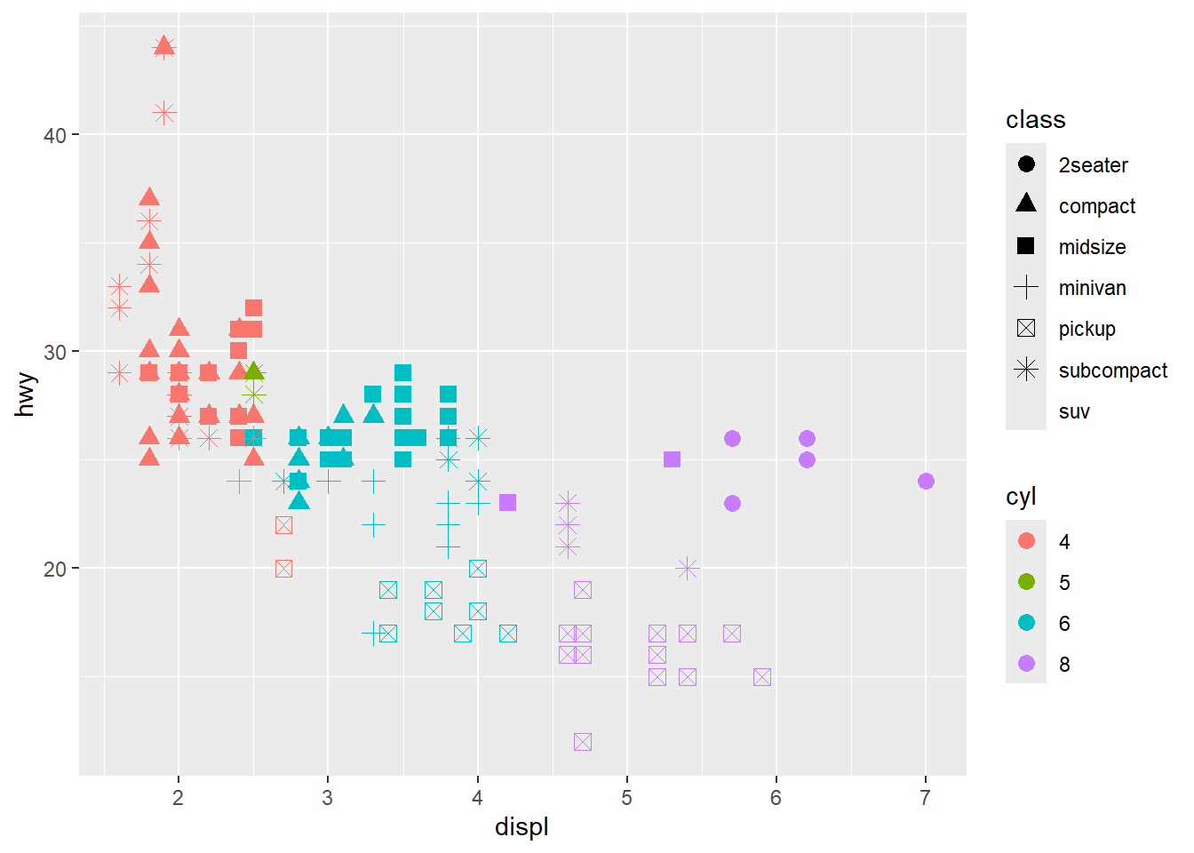
Or you can do so by changing the transparency of the points:
  ggplot(data = mpg) +

    geom_point(mapping = aes(x = displ, y = hwy, alpha = cyl),

               size = 3)
#> Warning: Using alpha for a discrete variable is not
#> advised.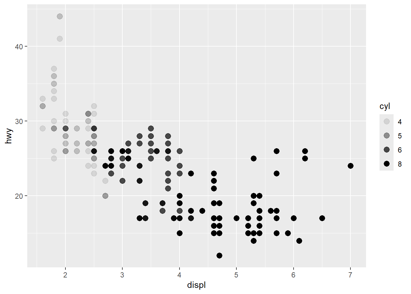
To change the legend title, add labs() function and use color argument:
  ggplot(data = mpg) +

  geom_point(mapping = aes(x = displ, y = hwy, color = cyl),

               size = 3) +

  labs(color = "Number of Cylinders")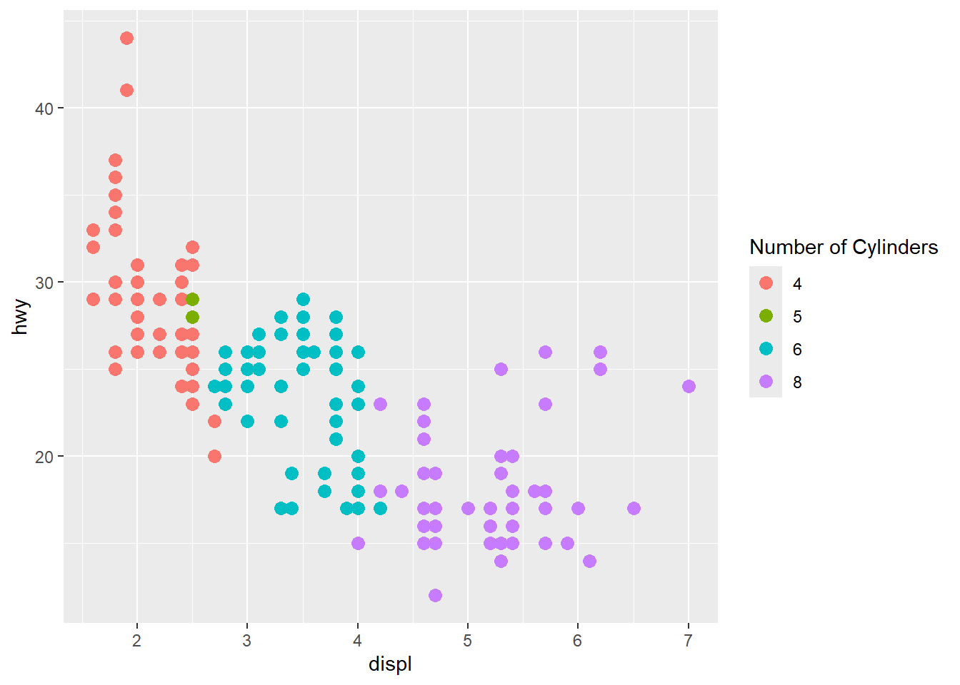
Let’s save the ggplot object. We will be adding new layers to this object shortly:
  gg <-   ggplot(data = mpg) +

    geom_point(mapping = aes(x = displ, y = hwy, color = cyl),

               size = 3) +

    labs(color = "Number of Cylinders")
Adding Labels
To add labels to your ggplot object, you can use labs() function once again. Inside this function, you specify the plot title, subtitle, labels of x and y axes:
gg <- gg +

  labs(title = "Highway Miles per Galon vs Engine Displacement",

       subtitle = "From mpg dataset",

       x = "Engine Displacement",

       y = "Highway Miles per Galon")


print(gg)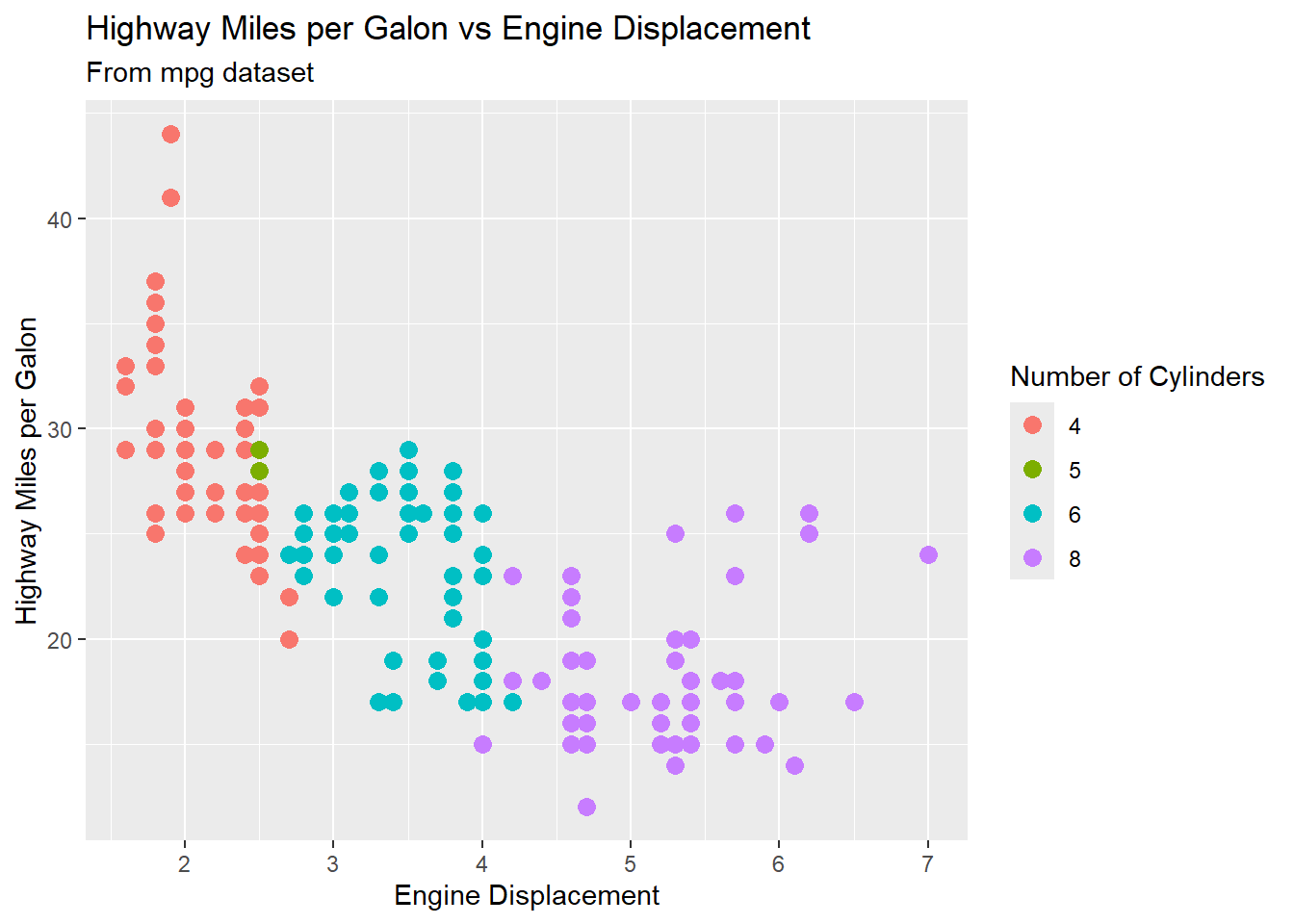
Adjusting Limits of Axes
The x and y axes limits can be controlled in 2 ways:
You can change the axis limits using xlim() and ylim() functions. You need to pass a numeric vector of length 2 (with max and min values) or just the max and min values:
  gg +

  xlim(c(0, 4)) +

  ylim(c(0, 25))
#> Warning: Removed 170 rows containing missing values or values
#> outside the scale range (`geom_point()`).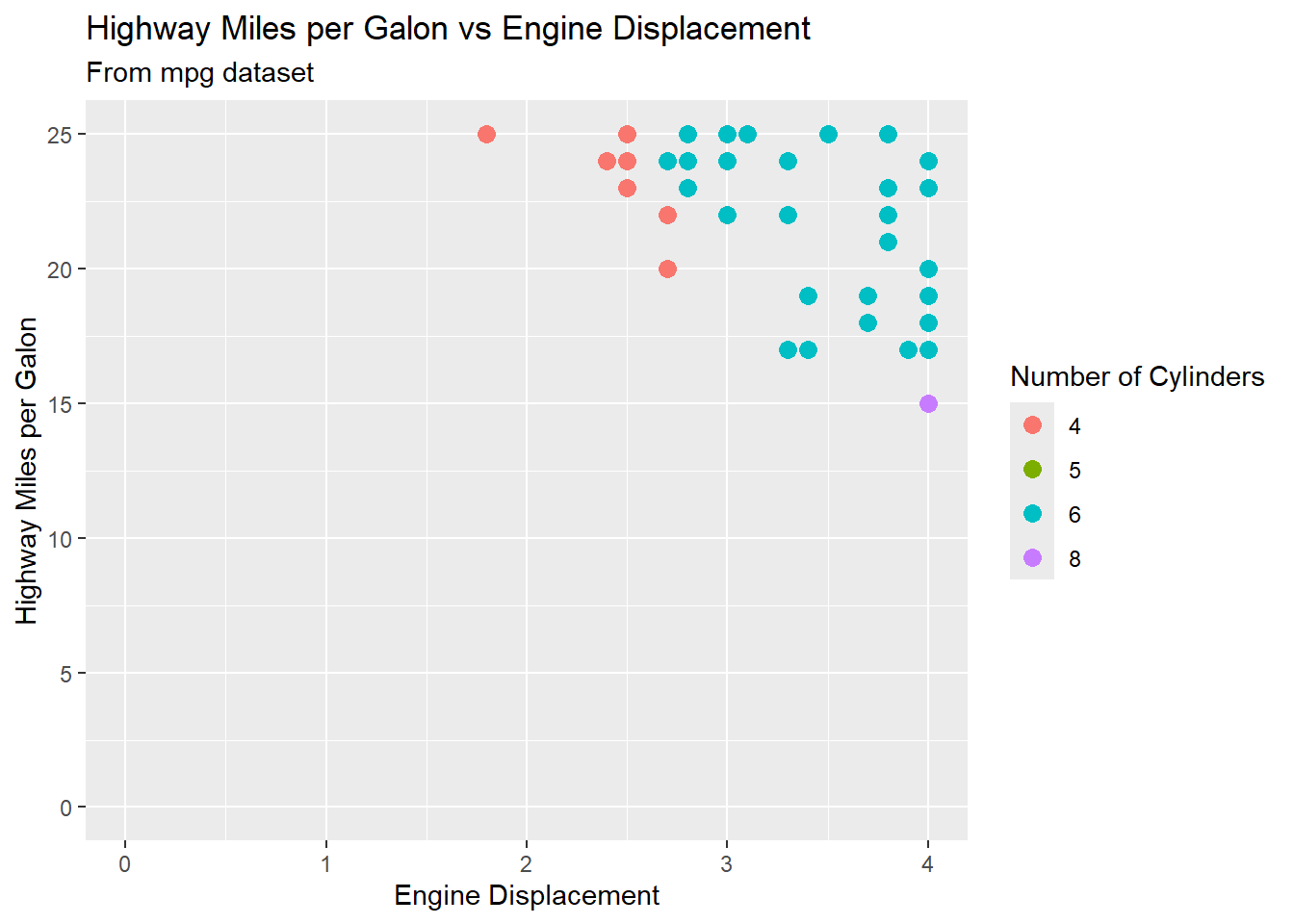
The limitation of this approach is that it deletes the points outside the specified range. The other approach is to change the x and y limits by zooming in to the region of interest without deleting points. It is achieved using the coord_cartesian() function:
  gg +

  coord_cartesian(xlim = c(0, 4),

                  ylim = c(0, 25))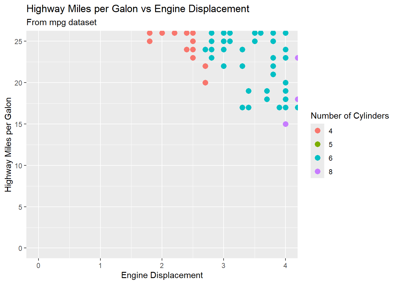
There is a primary argument that affects the appearance of the ticks on the axes: breaks. Breaks controls the position of the ticks, or the values associated with the keys. You pass this argument to either scale_x_continuous() or scale_y_continuous() functions, depending which axis you want to modify:
  gg <- gg +

    scale_x_continuous(breaks = seq(0, 8, 0.5)) +

    scale_y_continuous(breaks = seq(15, 50, 10))


print(gg)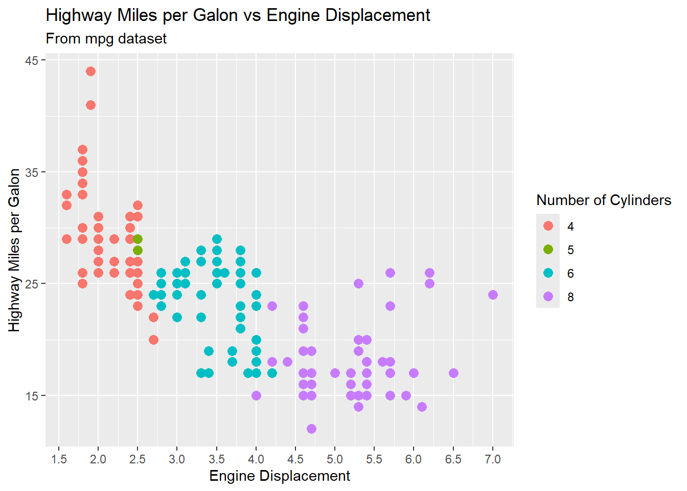
Themes
You can customize the non-data elements of your plot with a theme() function. For example, you can change the background of the plot:
  gg +

theme_bw() 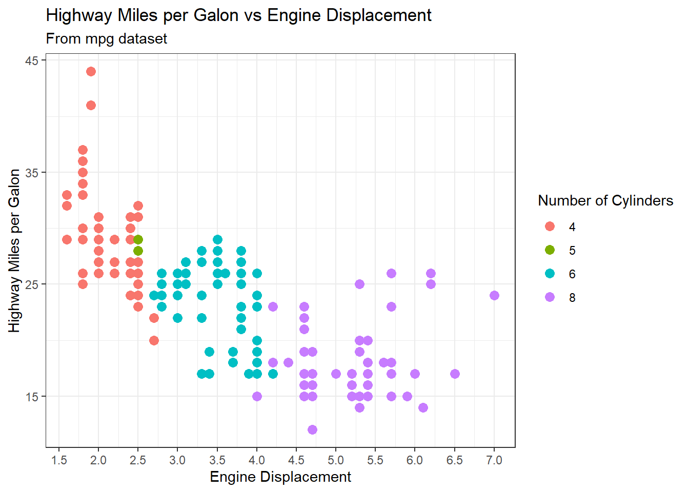
  gg +

theme_classic() 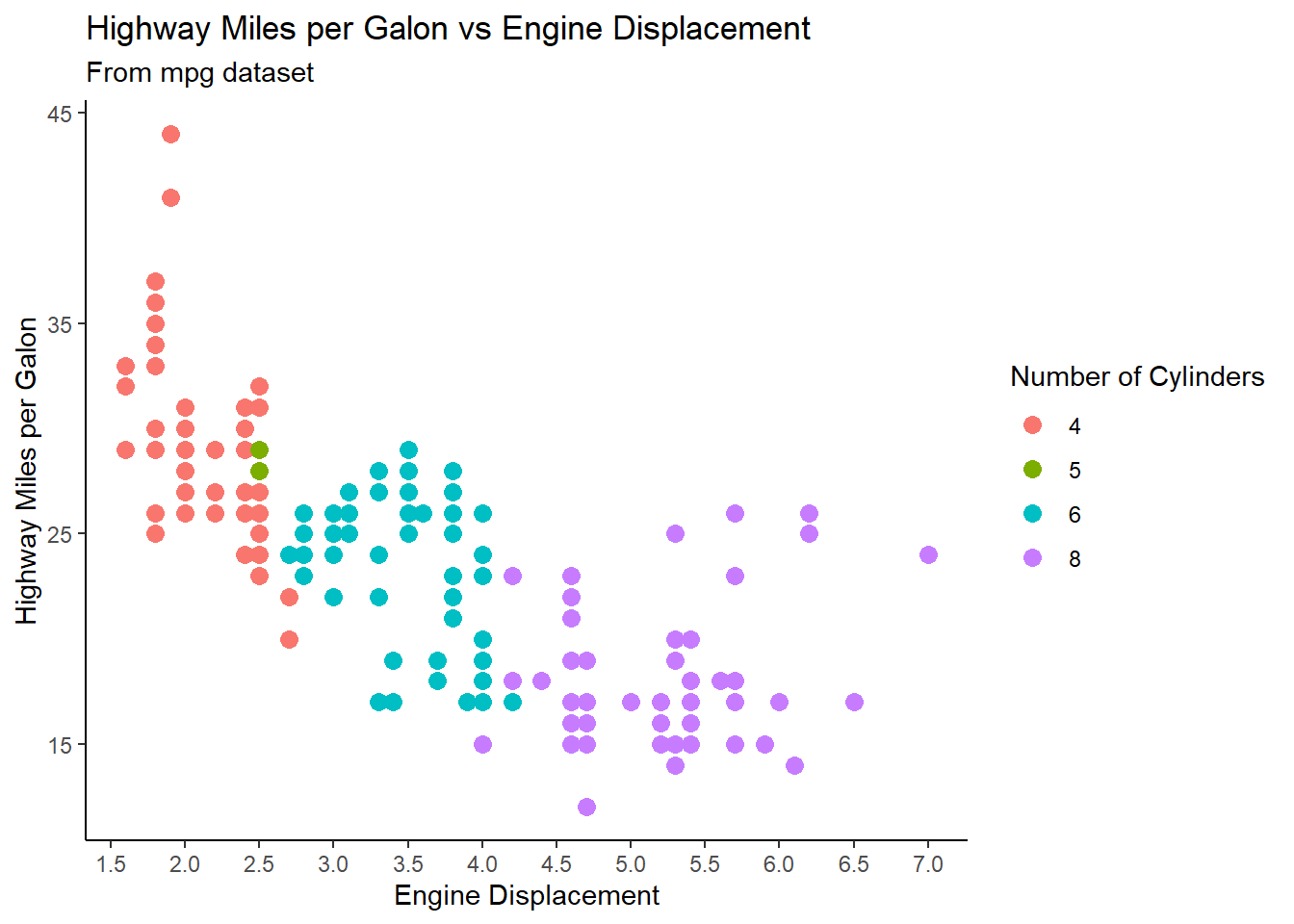
  gg +

theme_dark() 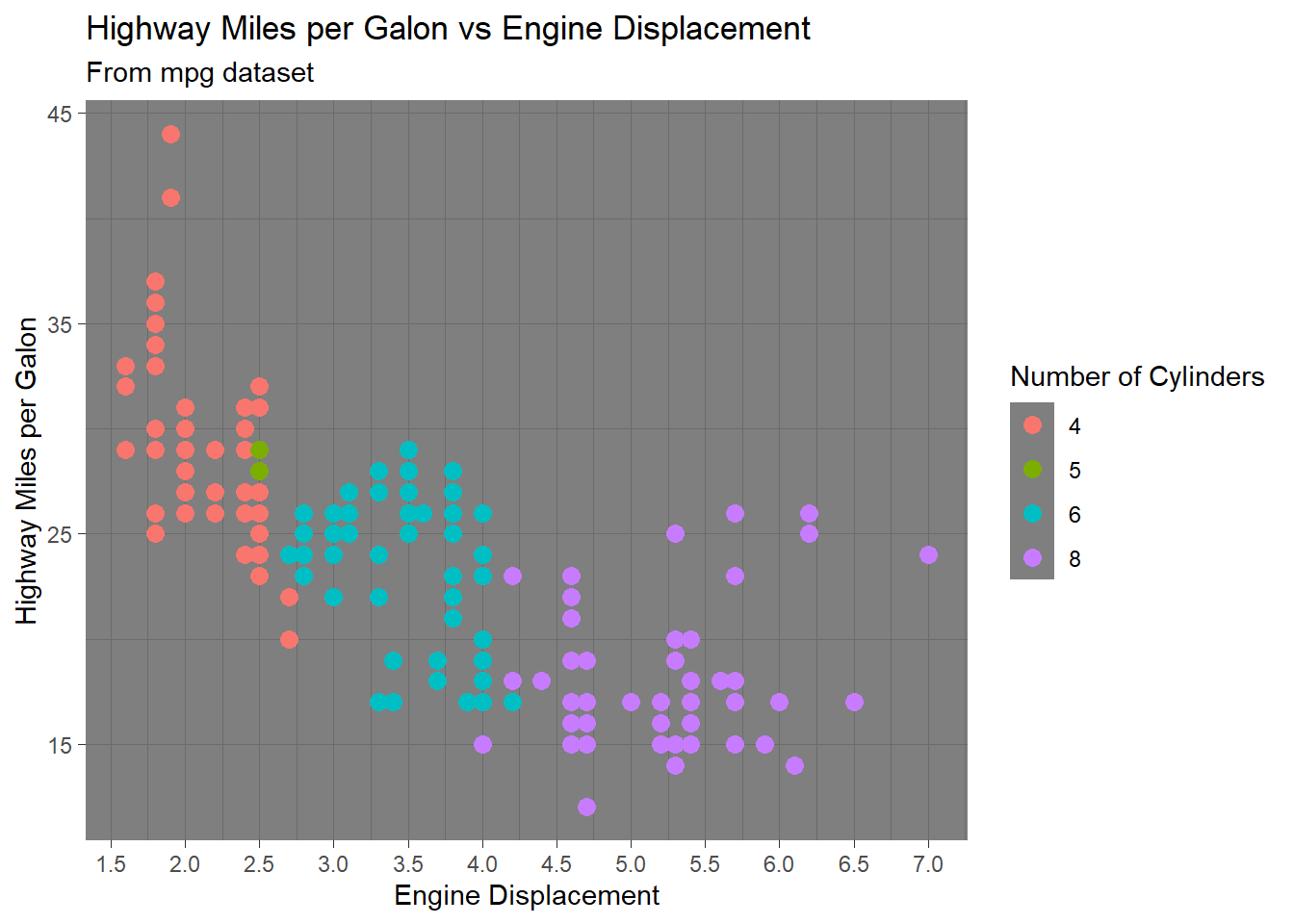
  gg +

theme_light() 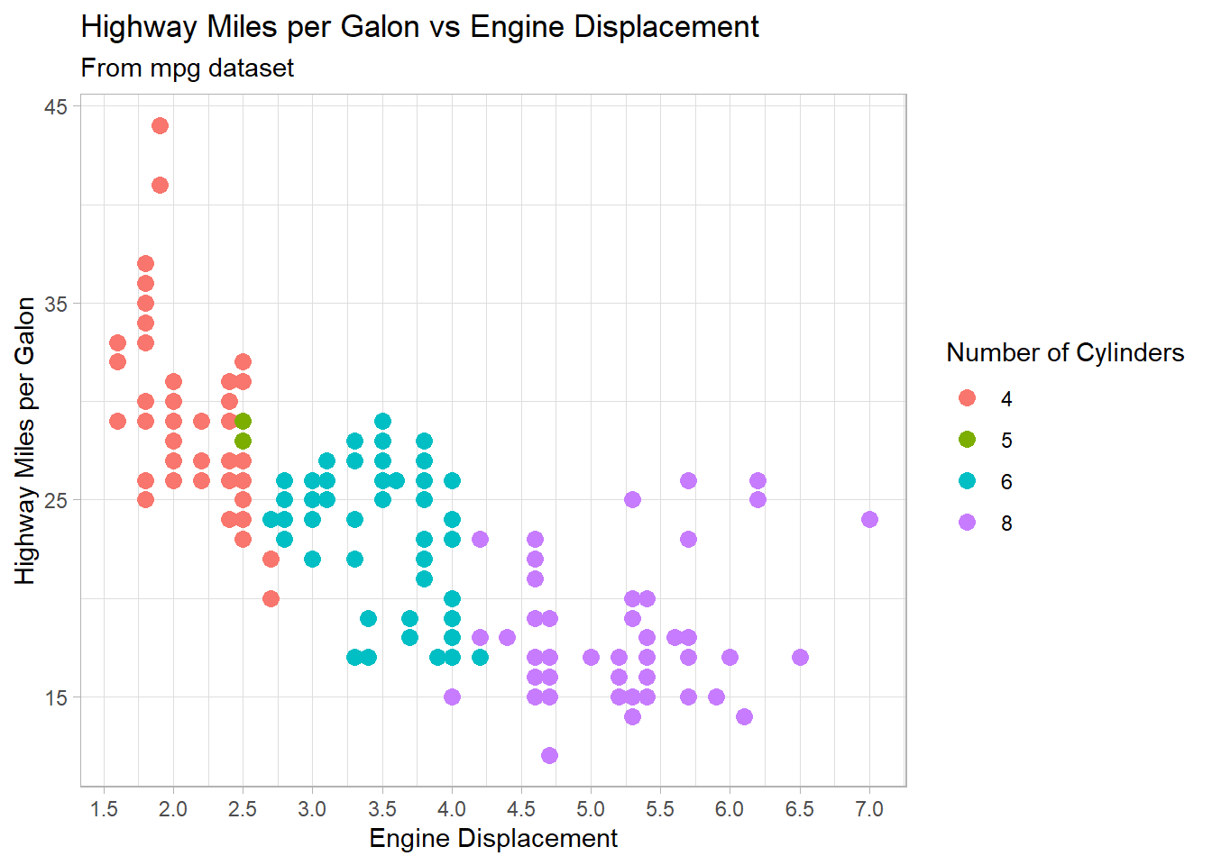
  gg +

theme_linedraw() 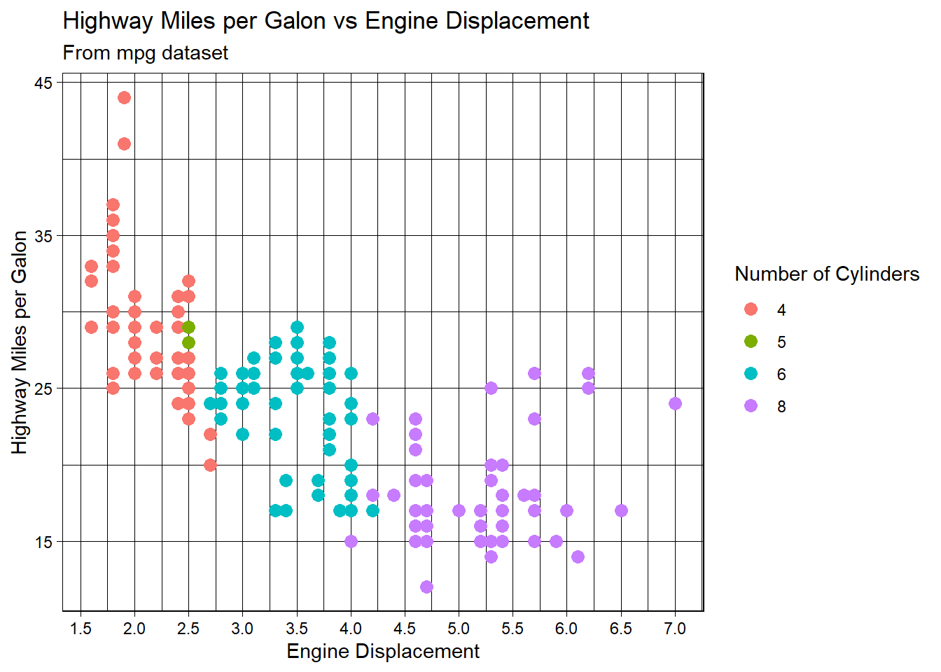
  gg +

theme_minimal() 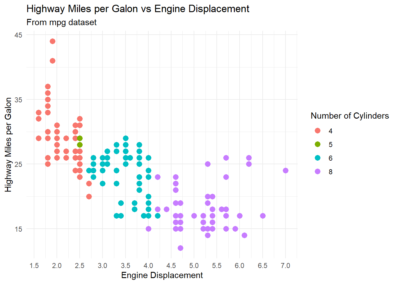
  gg +

theme_void() 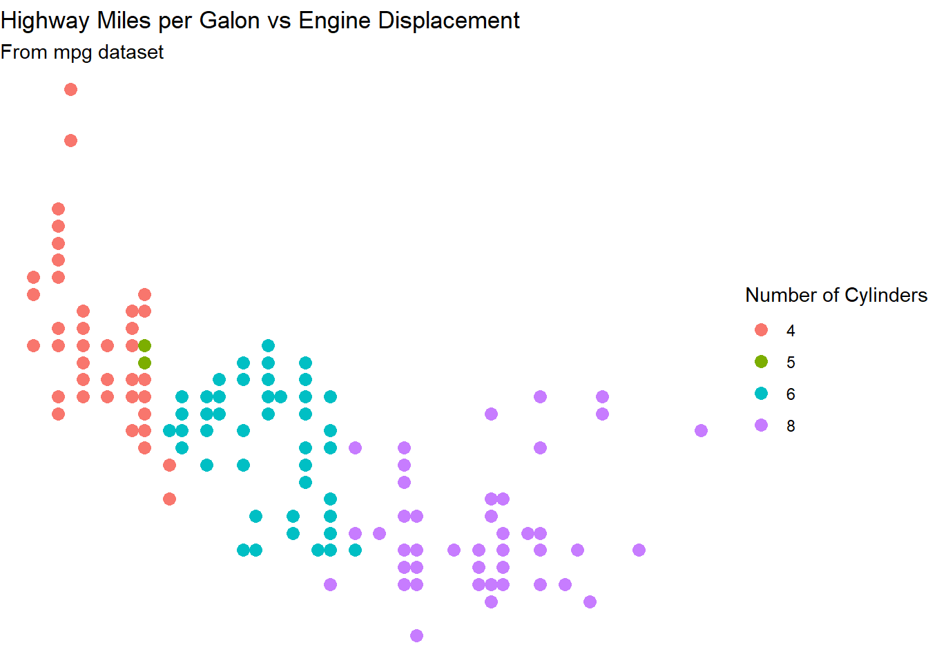
Let’s select theme_bw() option and update our plot:
  gg <- gg +

    theme_bw()
Further, we can change the color and size of titles, size and angle of ticks on axes, and the location of legends:
  gg <- gg +

    theme(plot.title=element_text(size=15, face="bold", color = "red"),

             axis.text.x=element_text(size=10, angle = 45),

             axis.text.y=element_text(size=10, angle = 45),

             axis.title.x=element_text(size=12, color = "blue"),

             axis.title.y=element_text(size=12, color = "blue"),

             legend.position = "top")

print(gg)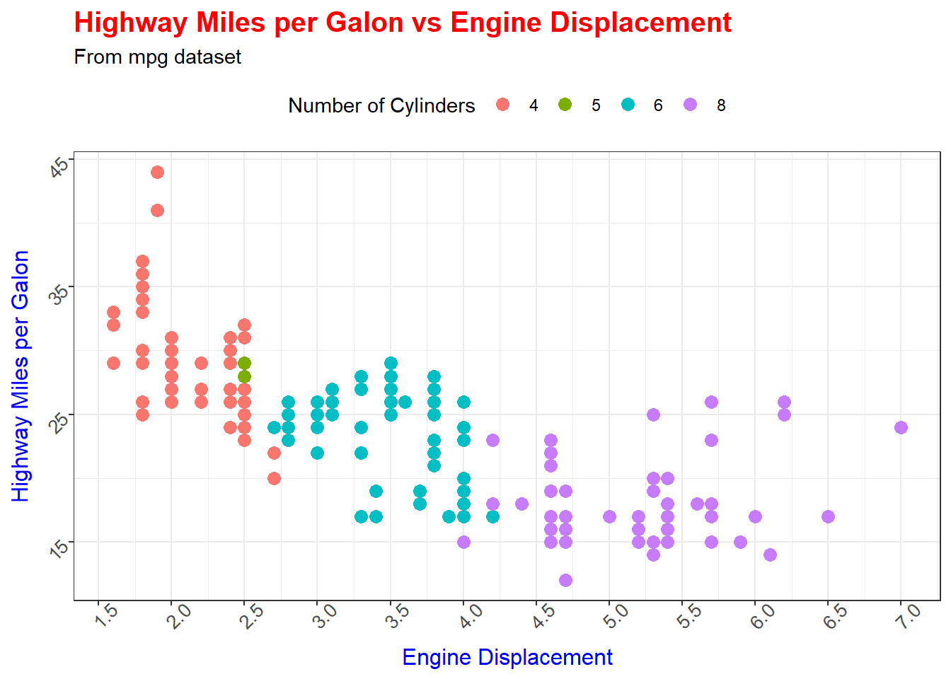
Facets
When working with categorical variables, it becomes particularly useful to split your plot into facets, subplots that each display one subset of the data that correspond to the level of the categorical variable.
To facet your plot by a single variable, use the facet_wrap() function. The first argument of facet_wrap() should be a formula, which you create with ~ followed by a variable name (here “formula” is the name of a data structure in R, not a synonym for “equation”). The variable that you pass to facet_wrap() should be discrete. Let’s plot displ against hwy for each level of the class variable separately:
  ggplot(data = mpg) +

  geom_point(mapping = aes(x = displ, y = hwy)) +

  facet_wrap(~ class)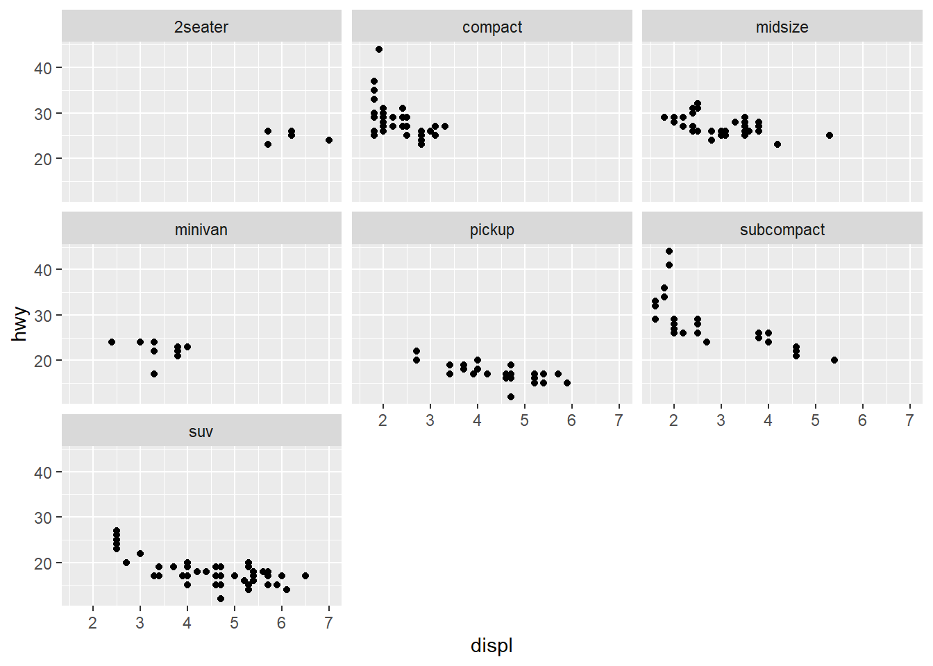
You can decide how the plots should be displayed by specifying the number of rows in the final plot:
  ggplot(data = mpg) +

  geom_point(mapping = aes(x = displ, y = hwy)) +

  facet_wrap(~ class, nrow = 2)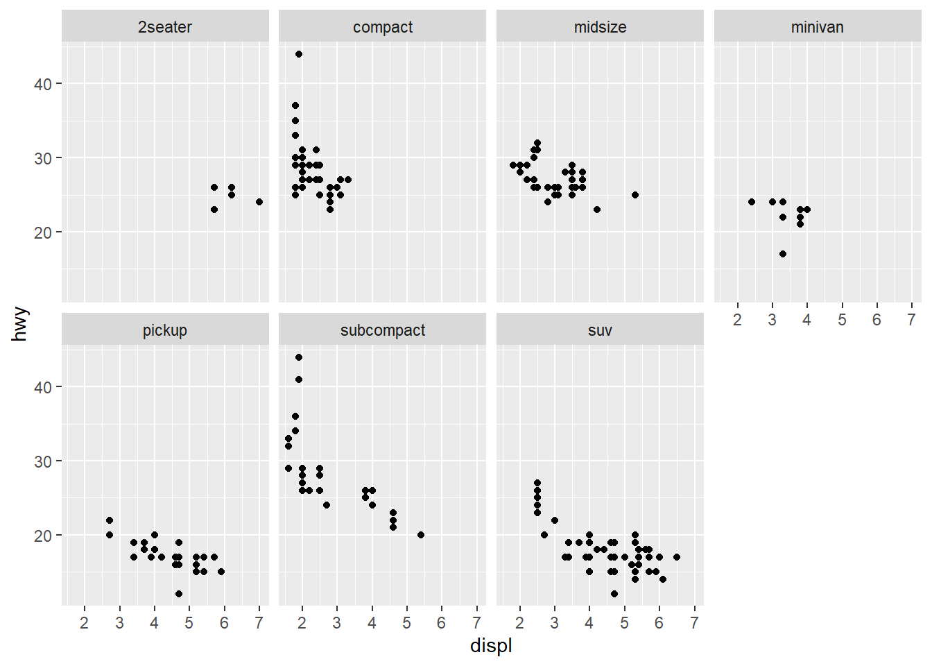
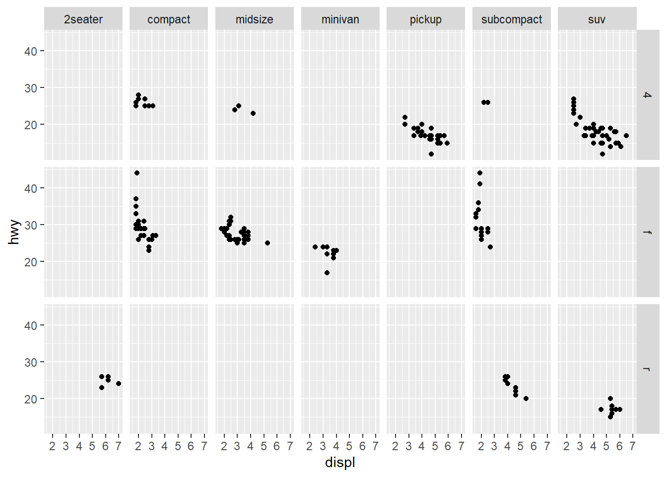
To facet your plot on the combination of two variables, add facet_grid() to your plot call. Let’s plot displ against hwy for different combinations of levels of the class and drv variables:
  ggplot(data = mpg) +

  geom_point(mapping = aes(x = displ, y = hwy)) +

  facet_grid(drv ~ class)